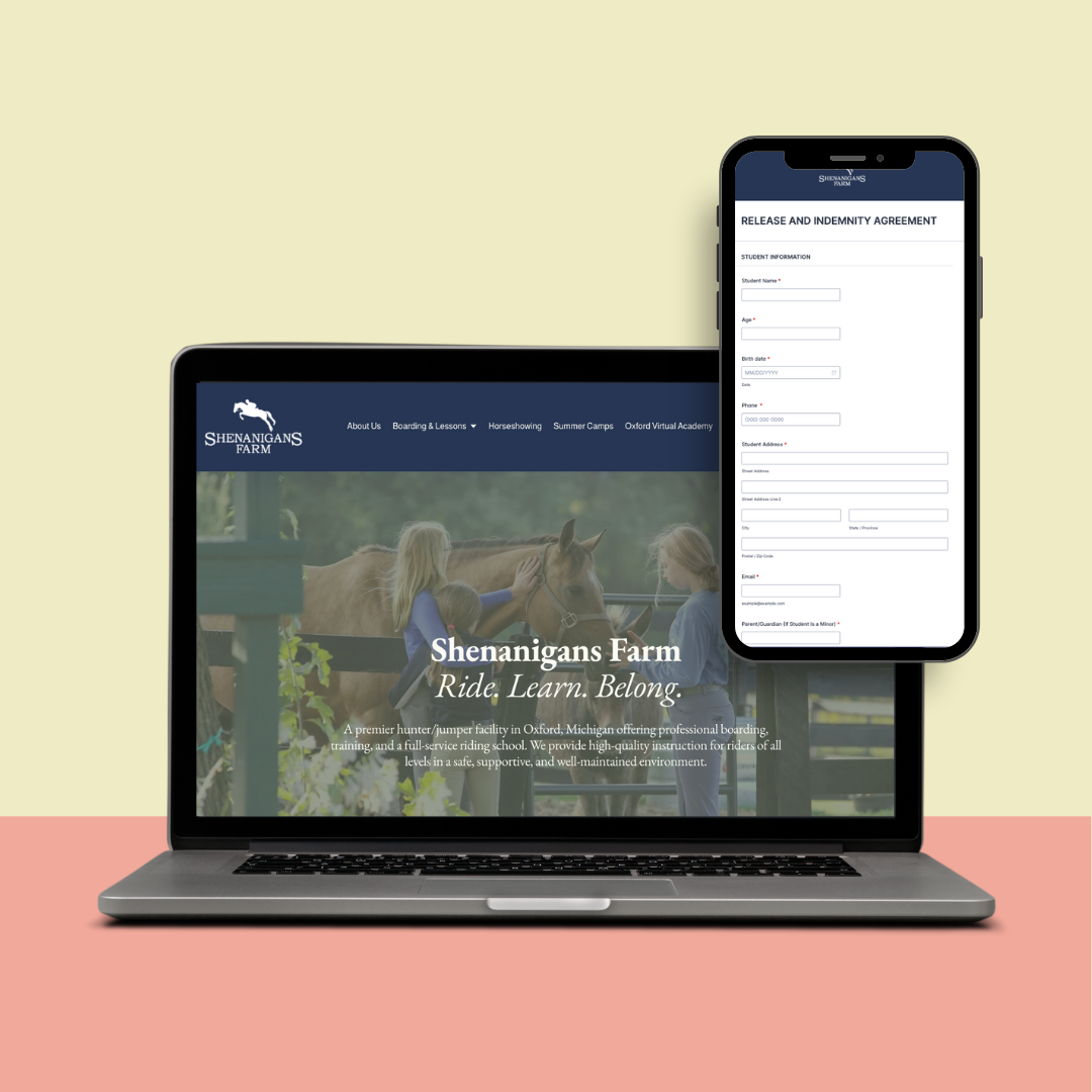
SHENANIGANS FARM

When Shenanigans Farm came to Jane & Co, the goal wasn’t to start from scratch, it was to evolve. We wanted to preserve the established, familiar feel of the farm that clients already loved, while giving the brand a fresh, cohesive update. We developed a refined color palette that honored the original aesthetic, strengthened the logo for better visibility across platforms, and gave the visual identity a more polished, professional edge, without losing its down-to-earth charm.
The Process
Behind the scenes, we streamlined operations by digitizing key forms, improving client workflows, and designing a website that serves as both an inviting first impression and a functional hub for current riders. We optimized the farm’s Google Business profile to boost local visibility and draw in new leads. Our partnership didn’t stop at the rebrand, we continue to support Shenanigans Farm with ongoing client acquisition strategy, content planning, and digital tools that keep the business growing and the lesson program full.